My Research
For my Little Big Data, I did A LOT of research. The majority of what I was interested in, I found too little data (too specific or inaccurate search) or way too much data (too many meteorites, too many earthquakes, etc).
Success?
The most interesting data set I found was the Candidate Planets that were discovered using the Kepler spacecraft. However, the confirmed planet list contained 7,000+ planets (I’m still thinking about it, though). A more fitting set of information I found was a list of multi-planetary systems, most of which were discovered using Kepler. I am a little iffy because my information comes from…wikipedia. But, I did a few verifications with the Exoplanet Archive, a related source that pulls from Nasa, and confirmed that Wikipedia used the same information for each subject. Why can’t I use the Exoplanet Archive? Because they sort their data by planet and individual object pages instead of solar system list.
What I am Looking At and WHY
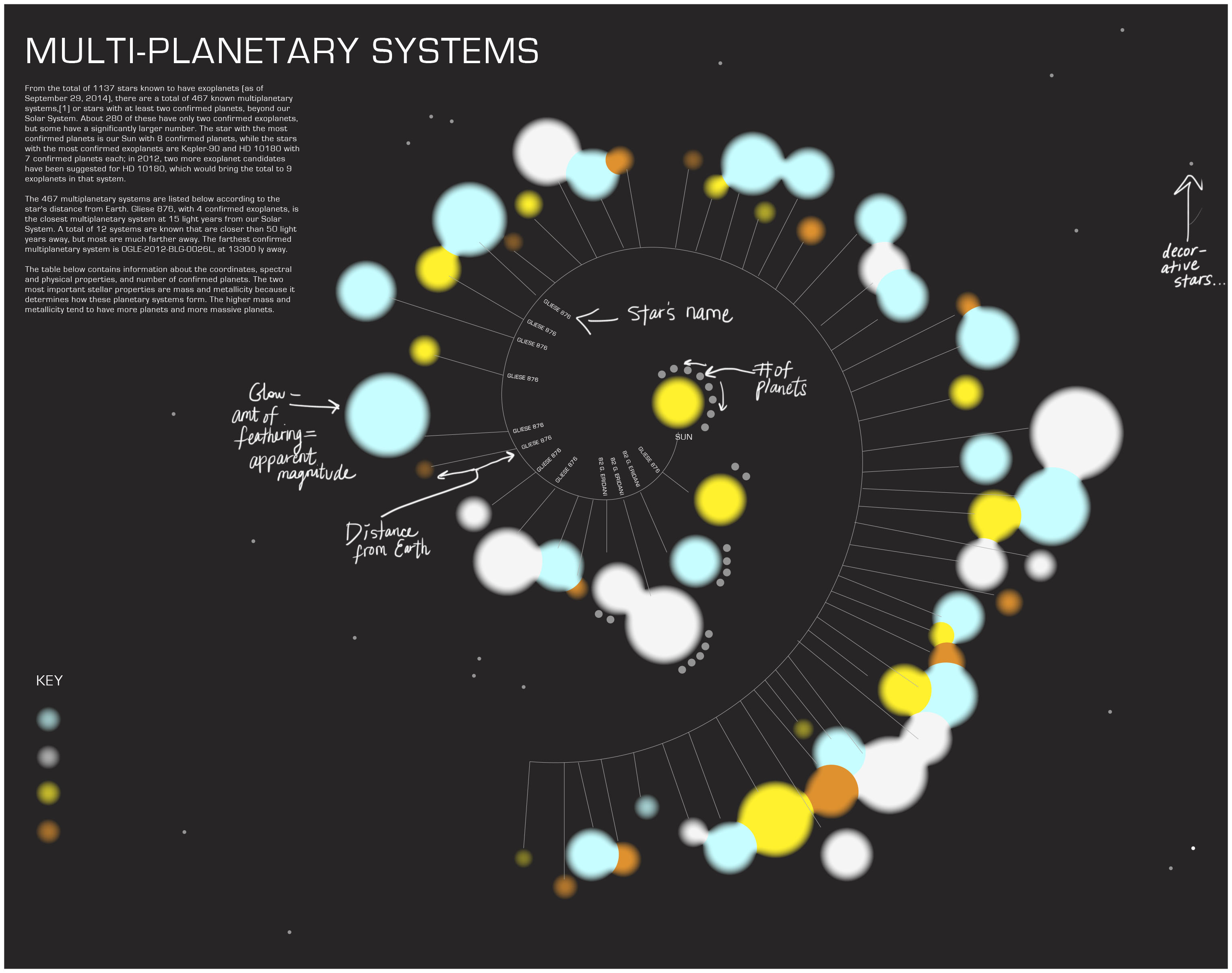
The table of information I am looking at contains
1. The star’s name
2. The constellation it lives in
3. Its apparent magnitude (how bright it looks to the human eye)
4. Its distance (in ly)
5. Spectral Type (what phase of star it’s in)
6. Solar Mass
7. Temperature (in Kelvin)
8. Age
9. How many planets orbit it
The reason I am interested in the Kepler multiplanetary systems is because it is a showing not only a huge step in the field of space exploration and discovery but is also allowing us to see what has been in front of us this whole time, several solar systems that might or might not have life on them. The planets are worth noting because they all have several characteristics that make them new-earth-worthy; why I am still hooked on the Confirmed Planets list. It is still an interesting approach to look at the stars that have been established as possible new suns. How old are they? Which ones are closest to us? Which look the closest to our sun, in age, spectral type, mass?
Here is the .xlsx_file
Here is an idea for my visualization:
On a completely different strand of my brain
Here is the other_information I was looking at and its source. I got a clue that maybe more than 1,000 is okay but It shows the names of all planet candidates considered by Nasa/Kepler. Along with them it shows their (in relation to Earth’s) mass, density. And their temperature, orbit period, eccentricity (shape of their orbit), inclination (tilt of their orbit), distance from Earth, their Star’s temperature, mass, radius, metallicity (ratio of iron to hydrogen), and apparent magnitude. I’m bouncing back and forth between these two ideas and I am torn between what is most important, what can be taken out.
What I have established
I want a formal, futuristic look, using Eurostile typeface. The colors of my sketch are my palette as of now, unless I have to include more extreme, saturated yellows and oranges (for star types or planet differentiation).